

 English
 Русский
 中文
中文
 Español
 Deutsch
 Português

Hi everyone. I have been experiencing your platform a lot lately and noticed if a share didn't have enough liquidity there were some price gaps in range candles which negatively affect drawing them. Take a look a the picture
Chart Range(4)
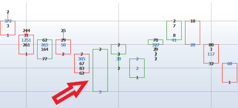
Green candle should have had 5 price levels but we see more What is the best solution to avoid such problem if I use that kind of a chart Thank you in advance
コメント (0)
ログイン または アカウントを作成, コメントを残すにはログインまたは新規登録してください
まだコメントはありません。最初のコメントを書きましょう!