

 English
 Русский
 Español
 Deutsch
 Português
 日本語
日本語

Hi everyone. I have been experiencing your platform a lot lately and noticed if a share didn't have enough liquidity there were some price gaps in range candles which negatively affect drawing them. Take a look a the picture
Chart Range(4)
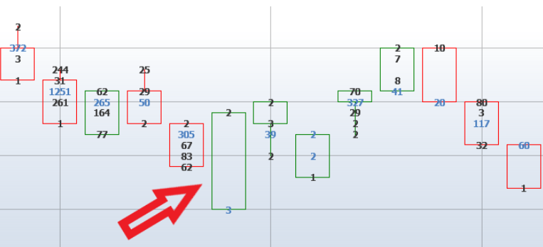
Green candle should have had 5 price levels but we see more What is the best solution to avoid such problem if I use that kind of a chart Thank you in advance
评论 (0)
登录 或 创建账户, 登录或注册以发表评论
暂无评论,成为第一个评论者!